Tuesday, 20 March 2012

My Team Logo


This image shows my initial brain storm and how three sets of two random words (one from each brain storm; water polo, Aphrodite) can be combined using a speed method of brain storming to create interesting initial concepts. These are located in the bottom half of the page. The logo design is for the Scandinavian (Swedish) Olympic Women's Water Polo Team.
1. The first in the bottom left corner is derivative from the words 'net' and 'shell'. The top thumbnail depicts a shell which related to the birth of Aphrodite from the sea. The shell is rendered using the pattern of a water polo net combining a feature of the game with a motif associated with the Greek God.
2. The second concept was inspired from the words 'ball' and 'birds'. This concept is further developed from the initial logo ideas posted in the Clash of the Titans blog posted a few weeks back. The use of imagery relating to both the sport (ball) and the Greek God (swan – Aphrodite is often depicted riding upon the back of a swan or goose) combine to create an interesting emblem (second from the left at the bottom of the page). From here I further developed the design to exclude the imagery of the ball and focus on the shapes that can be created with the shape of the swan's neck using reflection and stability as a base. This concept is continued below.
3. For the third concept I attempted to create a typographic design inspired by the words 'condensation' and 'feather'. The first thumbnail was created using inspiration from the American logos we looked at last week. The simplistic imagery accompanied with text all on an angle creates a simple yet striking dynamic design. Another idea was the capital 'A' created out of feathers and enclosed within a shiny, transparent, circular shape representing 'condensation' and could also be interpreted as a representation of the ball used. I returned to this idea further up the page using a lowercase 'a' as a replacement. This development helps distinguish the graphic from the similar 'anarchy' symbol, however it still has this connection which is inappropriate for the status and professionalism of the team.


The shape created initially was reminiscent of an 's.' It was only logical to follow this connection and use the shape as the main focal point within a typographic logo. This design will allow for use of the 's' shape only as a symbol only, or accompanied with the type as an alternative typographic design. I began to look as the proportion of the 's' shape, and tried to make them emulate a womanly figure to further connect the design to Aphrodite and women in general. This doesn't really seem to be coming through yet, more development is needed. I have also begun thinking about the negative space the shape creates. I am thinking of incorporating the water polo ball using the negative space within the design, or perhaps water droplets/splashes to further connect the design to the water aspect of the sport and also the birth of Aphrodite. This is only in the very beginning of this idea, I have yet to explore it on paper.
When researching the colours used in Olympic Water Polo, it is not surprising to see teams represented using their national colours. The most common colours used were blue, nay blue, red, white green and yellow. The Colours of the Swedish flag is blue and yellow. Using these colours in the logo design would successfully link the team to their country, however these colours are overused in the league, and wouldn't help make the team stand out. An idea is to use either pink or purple in the design to help distinguish the team from others within the league. This colour choice is not only because they aren't represented within the league, but also because they are sacred to Aphrodite and represent femininity. 

Tuesday, 13 March 2012

Native American Motifs

The Washington Redskins football team (NFL)
To see the evolution of the Redskins' logo and logo Alternates, please click the following link:
http://www.sportslogos.net/team.php?id=168


The Redskins logo has always depicted the face of the Chief. There are two exceptions, however, one logo was a spear that was used from 1965 – 1969, and one of a burgundy 'R' within a burgundy circle with two golden feathers attached, used from 1970. Despite being considered an insensitive design towards Indigenous Americans, the Redskins logo has not changed since the redesign in 1972. The logo depicts an evolved illustration of a Native American Indian Chief in profile facing the right. The illustration is housed within the same circle and feather design that surrounded the 'R' in the 1970 logo. The golden colour is derived from their uniform colour of burgundy and gold. The Burgundy was used in logo designs prior to the current logo which dropped the use of the burgundy colour.
This is probably a more respectful representation of Native Americans in comparison to some other logos as the image isn't cartoonish. This logo shows the positive aspects of the Native American culture, representing their strength and courage rather than mocking them. The strong and serious expression upon the Chief's face displays the great and powerful spirit that the Native Americans possessed. The circle in Native American culture represents 'the sun, the moon and her children, man and woman.' The circle also has a spiritual connections with the Native American people, connecting spirit and man for the purpose of greater spiritual understanding and evolution. The use of feathers in the design is also highly significant in the Native American culture. Feathers were worn by Native American Chiefs (as depicted within the logo design) and symbolises their connection with spirits and celestial wisdom. Feathers also represented the power of the air, wind and the thunder gods.
Legal action was sought from Native American groups and activists in regards to the use of the term 'Redskins' when the name of the team was changed in 1993. Despite the uproar a survey was conducted questioning Native Americans from the 48 continental states of the U.S asking whether they find the name of the team 'Redskins' offensive. Surprisingly 91% of those surveyed deemed the name acceptable, contradicting the actions of the activists.
I don't believe that the Redskins logo is designed in an offensive manner, rather the opposite. It shows a level of understanding of the Native American culture through the motifs used, and the illustration of the Chief is strong and powerful, not demeaning. I find the name of the team to hold a greater ability to offend rather than the logo due to the origin and nature of the term – referring to skin colour, a term to count the number of 'Indians' scalped/'exterminated.' The connection of this team name transfers the negative connotations to the logo which makes an otherwise respectful design offensive. It is also argued that "any stereotype, whether positive or negative, is a hindrance to the advancement of a group," and "the use of any stereotype in the portrayal of Indians is considered ... to be contributory to their dehumanization and deracination." – http://en.wikipedia.org/wiki/Washington_Redskins_mascot_controversy


Bibliography:
http://en.wikipedia.org/wiki/Washington_Redskins
http://www.dinesh.com/history_of_logos/nfl_logos/washington_redskins_logo_-_design_and_history.html
http://en.wikipedia.org/wiki/Washington_Redskins_mascot_controversy
http://www.whats-your-sign.com/circle-symbol-meaning.html
http://www.whats-your-sign.com/symbol-meaning-of-feathers.html

Monday, 12 March 2012

Indigo Design Network

Talking Stick: The Real Life Of Today's Mayans
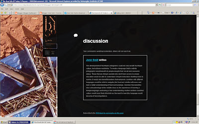
The development of the Mayan pictograms could not only benefit the Mayan culture, but cultures worldwide. To create a language that is entirely pictographic would benefit all people despite their social and economic status. Those that are living in poverty who don't have access to proper education would be able to understand simple instructions that they need to survive. It would also benefit travellers that venture to countries with different languages would be able to navigate, find food and shelter with ease and have a better understanding of their surroundings. However this benefit is also a disadvantage to the middle class as the experience of learning a foreign language and having a true understanding of other another countries' culture would most likely diminish as the need to learn the language would become of less importance.


Bibliography:
www.indigodesignnetwork.org/

Aboriginal Motifs Blog

Functions and Philosophies
Consent must be acquired for the reproduction of Indigenous traditional arts. If traditional communal designs are included, consent may be required from traditional custodians and community members as well as the artist. In some cases the art may belong to more than one group. In this case consent must be sought from all identified groups. The project may only go ahead if a consensus can be reached.
If an artist/s or community group wish to collaborate with an Indigenous artist communication and consultation with Indigenous artists and their communities must take place in the initial development of the project. The project may only proceed if consent is achieved.

Moral Rights and Issues
It is not only offensive to the Aboriginal culture if a non-Indigenous artist was to produce work using traditional Aboriginal styles, but also for other Indigenous artists to use styles that are representative of a region that they have no attachment or belonging to. For an Aboriginal artist to produce artwork that references traditional designs or stories from regions that they don't have a direct link to, permission must be granted from the elders.
A high concern of the Aboriginal community is the authenticity of Aboriginal artwork. The use of Aboriginal designs or their appropriation without consent from the artist or the community involved is disrespectful and unlawful. Artwork is sometimes created using Indigenous styles by non-Indigenous people who claim that the artwork is Indigenous. This often occurs with fake boomerangs and didgeridoos that are imported and sold as authentic Indigenous products. The imitation of the Indigenous artworks is interpreted as undermining the cultural authenticity of Indigenous visual arts. It also takes away a valuable income to the Indigenous community. Sometimes graphic designers aren't aware of this protocol and use Aboriginal motifs and sacred symbols in designs and logos.

Bibliography:

Tuesday, 6 March 2012

Clash of the Titans

1) Who are the Titans?
The Titans were a race of godlike giants in Greek mythology, who ruled the Earth before they were overthrown by the Olympians. The Titans were determined by generations. The first generation of Titans were the twelve children of Gaia and Uranus. each was believed to personify the forces of nature. The six sons and six daughters included: Cronus and Rhea, Iapetus and Themis, Oceanus and Tethys, Hyperion andTheia, Crius and Mnemosyne, and Coeus and Phoebe. The first generation were the aunts, uncles, and parents of Zeus (Cronus and Rhea) and the other Olympian Gods.


2) Are the any interesting motifs you see frequently appearing (Eg. Lightning bolts)? How do you interpret their meaning? Can you name a modern version, of this motif, used today?
Lightening/Lightening Bolt – There is a thunder storm raging with lightening the night that Perseus' mother was murdered and he was thrown from a cliff in a box with her body with the intention of death. He was found this stormy night by the fisherman who associates the storm with their union, however it appears to represent the rage of Zeus at the attempted murder of his son. A fierce lightening storm also occurs when a child is about to be born to the fisherman family. This could represent Perseus' own feelings towards the child as he believes that he will be excluded as he is not born from them but found and does not feel like their son. This shows the link between Perseus and his real father, Zeus. The same thunder storm occurs the night before Perseus and his earth family discover the statue of Zeus (who is holding a lightening bold in his hand, his body in an attack-ready stance) which is being torn down by the army of Argos. Lightening also reappears throughout the movie whenever Zeus appears or disappears, or wherever his power is present or being transferred i.e drawn into the Perseus' sword that was gifted upon him by Zeus.


The lightening bolt represent the enormity of Zeus' power and strength. Lightening is unpredictable and can strike fear within many in a large radius. We are at the mercy of lightening in a thunderstorm, it has the power to destroy our homes and take lives in an instant. In this way it also represents speed and agility. The AFL football team 'Port Power' use the lightening bolt within their team emblem. It is held within a strong fist that mimics the image of Zeus.


Another frequent motif was the presence of wings. Many winged creatures featured in the movie; creatures from the Underworld and the godly Pegasus – winged horses most commonly white but the most dominant and fierce of the Pegasus was black. It was sent to watch over Perseus and to aid him in his quest, a sign from the Gods, they're watching over him. Another winged creature was the eagle-like bird that is perched upon Zeus' throne. Zeus actually transforms into this bird when he disguises himself on earth. The feature of many fantastical winged creatures, and the transformation of Zeus himself implies that wings (that also feature on the King of Argos' throne and the silver armour of Zeus) represent a godly power.


"The eagle is a symbol for power, action, speed and perception, it has powers of intuition, creativity and can balance power with grace all these because the eagle has sharp vision which gives it the ability to see hidden truths and spiritual principles." – http://www.animal-symbols.com/eagle-symbol.html
The eagle is associated by the Greeks as the sacred emblem of Zeus. The eagle serves as Zeus' messenger and he has the ability to take this form as previously mentioned. It is also associated to a free spirit due to it's ability to fly to the mountaintops and silently into valleys. The eagle doesn't fear thunder and lightening (associated with Zeus), and is therefore seen as a symbol of spiritual power and courage. The eagle is still used today as the emblem of the United States of America. It was chosen for its long life, great strength and majestic looks, and represents freedom.


3) Is your Greek character in the movie? If so, does the film's interpretation match your research?
Aphrodite is not featured in the movie. She was mentioned, however, when the Queen of Argos proclaims her daughter to be of more beauty than Aphrodite herself. This sparks the first arrival of Hades, and alerts the people of Argos to their mistake of declaring war against the gods and dared to mock them.


4) Are any of the characters, in the movie, related (Eg. a mother or father, wife or husband, brother or sister) to your Greek myth? If so, how?
There were no relations of Aphrodite featured in this film. Some stories told of Zeus being the father of Aphrodite. My research does not support this relation as Aphrodite was born from the sea from the castrated parts of the God Uranus.


5) Is their a constellation of stars named after your Greek character?
There is no constellation that is named specifically after Aphrodite, but there is, however, one which represents her and her son Eros – Pisces. The Pisces constellation depicts two fish, a large fish and a small fish. The large fish ("the great mother") symbolises Aphrodite, and the smaller fish her son Eros. The story tells of Aphrodite transforming both her and her son into fish within the Euphrates River to escape the great monstrous fish, Typhon. Another version of this story claims that Pisces represents the fish that carried Aphrodite and Eros to safety.


6) How is Medusa killed? Does your Greek character have a weakness?
Medusa does not die, but is weakened. Perseus uses the reflection of his shield to locate Medusa as her power to turn men into stone does not work unless the eye contact is made specifically eye to eye and not reflected off a surface. Perseus uses this weakness to his advantage and beheads Medusa leaving her body to wander disorientated into the fiery depths below, incinerating her body in an explosion of flames. Her power remains as her head is used to defeat the Kraken at the end of the film.
Aphrodite's weakness included vanity, bad temper, jealousy and unfaithfulness.


7) Sketch at least 3 ideas for your logo and add them to this post.


Bibliography:
http://www.pantheon.org/articles/t/titans.html
http://edweb.sdsu.edu/people/bdodge/scaffold/gg/titan.html
http://ancienthistory.about.com/od/religionmyth/g/Titans.htm
http://www.animal-symbols.com/eagle-symbol.html
http://www.baldeagleinfo.com/eagle/eagle9.html
http://astrologywithdrz.com/pisces/piscesconstellation.htm
http://www.topastronomer.com/StarCharts/Constellations/Pisces.php
http://www.goddess-guide.com/greek-goddess-aphrodite.html