Tuesday 5 June 2012

AGIDEAS

Trends and Designers

A design trend that was featured heavily throughout the design conference was that of tactile design. This theme can be interpreted as a rebellion against computer generated design. Many designers were stepping back from the computer to design using hand made materials. Freedom and looseness is often present, and the texture/surface of the materials used adds a whole other dimension to the design, giving the viewer a more personal and tangible experience. 

An example of designers who follow this trend is the Dutch company, Autobahn. They take an experimental approach to typography, creating what they describe as 'comfortable confusion.' They use real life objects and methods to create visually intriguing and outstanding experimental typography.  Some of their experiments include using household products to recreate the Helvetica typeface by tracing a stencil with toothpaste and tomato sauce.
An online portfolio of their work can be viewed here.

Concept Evaluation

Another example of a designer who follows this trend is Jenny Grigg. Her book cover designs stand out on the shelf for their simplicity, beauty and the methods used to create the artwork. She created a series of designs for a collection of Peter Carey's novels. The first series of designs were created using old wooden blocks of type. They were purely type based but focused on a single letter from the title of the book. The designs were effective due to the translation of the imperfections in the wood cuts.
The second series that she designed were created using hand cut tissue paper that was moulded, folded and arranged into simple yet effective symbolic illustrations. These were photographs as they were. The texture and overlap of colours creates visually pleasing and intriguing designs which reflect the story that lies within. The use of visually tactile cover designs is especially important for book cover design as it supports the hand held object, enhancing the reader's experience. An attractive cover design holds something that computer generation cannot obtain. The desire to hold, touch and possess this piece of artwork and the novel that lies within is something that is lost on the internet.
Examples of these works can be viewed at her website.

Bibliography
jennygrigg.com

Monday 16 April 2012

Copyright Issues

Images
Where – www.gettyimages.com
I have sourced three images hat I may consider for use in this project. They are:
Image 1 – To display the logo on a uniform/swim cap/helmet.
Image 2 – To show the logo on equipment i.e water polo ball. 
Image 3 – How the logo would appear on a team bus.
How – There is a simple one page registration process, and once you are registered to the site you are eligible to purchase the images that they have available. The purchasing process is via credit/debit cards and you pay directly for the image. Some stock photo websites require you to purchase a set amount of 'credits' with your credit card and then use these credits to purchase the stock image with. With Getty Images this is not the case.
Once the image is purchased it is available for download. All images that are downloaded are compressed JPG files which are smaller file sizes to ensure a faster download speed. A CD of the image at full file size is available upon request. When selecting the size of the image you are wishing to purchase, always ensure that the dimensions of the image are an appropriate size for the intended use of the image. It is advisable to choose a size larger than the required dimensions to allow for rescaling and cropping of the image without losing image quality.
Cost – Once registered to the site the images are available for your purchase. This can be done via Visa, Mastercard or American Express. Each image has a range of sizes available for purchase and as the size of the image increases, so does the price quite steeply. Depending on the size of the image, you could pay anywhere from $10.00 – $1,000.00. The following is a screen capture of the pricing for an image that I may consider for purchase to display the logo on a uniform:
To view this web page click here.
Ts&Cs – There are two types of licensed images that are available for purchase on the Getty Images website. These are 'royalty-free images' and 'rights-managed images'. The uses of the two types of licenses are of great difference.
Royalty-free images are only paid for once. Once purchased you can use the image multiple times on multiple projects without paying any additional fees. You cannot, however, use the images in a pornographic, defamatory, libellous or otherwise unlawful fashion. These uses are prohibited.
Rights-managed images have many restrictions in place in regards to specific uses including size, positioning, duration of use and the use of the image in other countries. Extra fees may apply if you wish to use the image for multiple purposes, products or distribute the image to different countries. The 'scope of usage rights granted' will be determined once information is submitted regarding the intended use of the image.


Fonts
Where – www.fontfont.com
Three fonts that I have considered using for the logo design include the following:
Font 1 – Jackie
Font 2 – Tartine Script
Font 3 – Elegie
How – All that is needed to register to the site is your email address and a password and you are free to begin selecting fonts for purchase. The font that I have currently selected is FF Jackie. You can view the page for this font here. One you have decided upon a typeface that you like you can view the different buying options available for that particular font. This allows you to select the file format, character set and the number of licenses i.e. number of users who may use the font. The price rises depending on the number of licenses you are purchasing. If multiple users may be using the font, it is ideal to plan ahead and license for potential users to save money in the long run. As the number of licenses sold increases, the price per license reduces. The fonts are available for purchase via Visa, Mastercard or American Express.
Cost – As the number of licenses to be purchased increases, the price per license decreases. For my particular font it would cost me $65 to purchase 'FF Jackie Pro' in the 4 standard weights with the minimum of 5 licenses.
Ts&Cs – If I was to have purchased to typefaces as stated above, the 5 licenses allows for up to five concurrent users to use the font in a single geographic location. This means that all licenses may only be used within the one location i.e place of business.
The license allows for the font to be embedded within documents, applications or devices allowing for the text to be viewed/printed but not edited. If the text was sent to a third party with the ability for the text to be edited an additional license would need to be organised. A digitised copy is allowed to be sent to printers, however if they wish to edit the text they must purchase their own license of the font. You may not lease the font to third parties. If you wish to transfer the license this can be done as long as the recipient agrees to the Ts&Cs in writing and all copies by the previous owner is destroyed.
The software is not to be copied except for personal back-up purposes only. The font must not be modified unless prior written consent is granted.


Bibliography
www.gettyimages.com
www.istockphoto.com
www.fontfont.com

Tuesday 20 March 2012

My Team Logo


This image shows my initial brain storm and how three sets of two random words (one from each brain storm; water polo, Aphrodite) can be combined using a speed method of brain storming to create interesting initial concepts. These are located in the bottom half of the page. The logo design is for the Scandinavian (Swedish) Olympic Women's Water Polo Team.
1. The first in the bottom left corner is derivative from the words 'net' and 'shell'. The top thumbnail depicts a shell which related to the birth of Aphrodite from the sea. The shell is rendered using the pattern of a water polo net combining a feature of the game with a motif associated with the Greek God.
2. The second concept was inspired from the words 'ball' and 'birds'. This concept is further developed from the initial logo ideas posted in the Clash of the Titans blog posted a few weeks back. The use of imagery relating to both the sport (ball) and the Greek God (swan – Aphrodite is often depicted riding upon the back of a swan or goose) combine to create an interesting emblem (second from the left at the bottom of the page). From here I further developed the design to exclude the imagery of the ball and focus on the shapes that can be created with the shape of the swan's neck using reflection and stability as a base. This concept is continued below.
3. For the third concept I attempted to create a typographic design inspired by the words 'condensation' and 'feather'. The first thumbnail was created using inspiration from the American logos we looked at last week. The simplistic imagery accompanied with text all on an angle creates a simple yet striking dynamic design. Another idea was the capital 'A' created out of feathers and enclosed within a shiny, transparent, circular shape representing 'condensation' and could also be interpreted as a representation of the ball used. I returned to this idea further up the page using a lowercase 'a' as a replacement. This development helps distinguish the graphic from the similar 'anarchy' symbol, however it still has this connection which is inappropriate for the status and professionalism of the team.


The shape created initially was reminiscent of an 's.' It was only logical to follow this connection and use the shape as the main focal point within a typographic logo. This design will allow for use of the 's' shape only as a symbol only, or accompanied with the type as an alternative typographic design. I began to look as the proportion of the 's' shape, and tried to make them emulate a womanly figure to further connect the design to Aphrodite and women in general. This doesn't really seem to be coming through yet, more development is needed. I have also begun thinking about the negative space the shape creates. I am thinking of incorporating the water polo ball using the negative space within the design, or perhaps water droplets/splashes to further connect the design to the water aspect of the sport and also the birth of Aphrodite. This is only in the very beginning of this idea, I have yet to explore it on paper.
When researching the colours used in Olympic Water Polo, it is not surprising to see teams represented using their national colours. The most common colours used were blue, nay blue, red, white green and yellow. The Colours of the Swedish flag is blue and yellow. Using these colours in the logo design would successfully link the team to their country, however these colours are overused in the league, and wouldn't help make the team stand out. An idea is to use either pink or purple in the design to help distinguish the team from others within the league. This colour choice is not only because they aren't represented within the league, but also because they are sacred to Aphrodite and represent femininity. 

Tuesday 13 March 2012

Native American Motifs

The Washington Redskins football team (NFL)
To see the evolution of the Redskins' logo and logo Alternates, please click the following link:
http://www.sportslogos.net/team.php?id=168


The Redskins logo has always depicted the face of the Chief. There are two exceptions, however, one logo was a spear that was used from 1965 – 1969, and one of a burgundy 'R' within a burgundy circle with two golden feathers attached, used from 1970. Despite being considered an insensitive design towards Indigenous Americans, the Redskins logo has not changed since the redesign in 1972. The logo depicts an evolved illustration of a Native American Indian Chief in profile facing the right. The illustration is housed within the same circle and feather design that surrounded the 'R' in the 1970 logo. The golden colour is derived from their uniform colour of burgundy and gold. The Burgundy was used in logo designs prior to the current logo which dropped the use of the burgundy colour.
This is probably a more respectful representation of Native Americans in comparison to some other logos as the image isn't cartoonish. This logo shows the positive aspects of the Native American culture, representing their strength and courage rather than mocking them. The strong and serious expression upon the Chief's face displays the great and powerful spirit that the Native Americans possessed. The circle in Native American culture represents 'the sun, the moon and her children, man and woman.' The circle also has a spiritual connections with the Native American people, connecting spirit and man for the purpose of greater spiritual understanding and evolution. The use of feathers in the design is also highly significant in the Native American culture. Feathers were worn by Native American Chiefs (as depicted within the logo design) and symbolises their connection with spirits and celestial wisdom. Feathers also represented the power of the air, wind and the thunder gods.
Legal action was sought from Native American groups and activists in regards to the use of the term 'Redskins' when the name of the team was changed in 1993. Despite the uproar a survey was conducted questioning Native Americans from the 48 continental states of the U.S asking whether they find the name of the team 'Redskins' offensive. Surprisingly 91% of those surveyed deemed the name acceptable, contradicting the actions of the activists.
I don't believe that the Redskins logo is designed in an offensive manner, rather the opposite. It shows a level of understanding of the Native American culture through the motifs used, and the illustration of the Chief is strong and powerful, not demeaning. I find the name of the team to hold a greater ability to offend rather than the logo due to the origin and nature of the term – referring to skin colour, a term to count the number of 'Indians' scalped/'exterminated.' The connection of this team name transfers the negative connotations to the logo which makes an otherwise respectful design offensive. It is also argued that "any stereotype, whether positive or negative, is a hindrance to the advancement of a group," and "the use of any stereotype in the portrayal of Indians is considered ... to be contributory to their dehumanization and deracination." – http://en.wikipedia.org/wiki/Washington_Redskins_mascot_controversy


Bibliography:
http://en.wikipedia.org/wiki/Washington_Redskins
http://www.dinesh.com/history_of_logos/nfl_logos/washington_redskins_logo_-_design_and_history.html
http://en.wikipedia.org/wiki/Washington_Redskins_mascot_controversy
http://www.whats-your-sign.com/circle-symbol-meaning.html
http://www.whats-your-sign.com/symbol-meaning-of-feathers.html

Monday 12 March 2012

Indigo Design Network

Talking Stick: The Real Life Of Today's Mayans
The development of the Mayan pictograms could not only benefit the Mayan culture, but cultures worldwide. To create a language that is entirely pictographic would benefit all people despite their social and economic status. Those that are living in poverty who don't have access to proper education would be able to understand simple instructions that they need to survive. It would also benefit travellers that venture to countries with different languages would be able to navigate, find food and shelter with ease and have a better understanding of their surroundings. However this benefit is also a disadvantage to the middle class as the experience of learning a foreign language and having a true understanding of other another countries' culture would most likely diminish as the need to learn the language would become of less importance.


Bibliography:
www.indigodesignnetwork.org/

Aboriginal Motifs Blog

Functions and Philosophies
Consent must be acquired for the reproduction of Indigenous traditional arts. If traditional communal designs are included, consent may be required from traditional custodians and community members as well as the artist. In some cases the art may belong to more than one group. In this case consent must be sought from all identified groups. The project may only go ahead if a consensus can be reached.
If an artist/s or community group wish to collaborate with an Indigenous artist communication and consultation with Indigenous artists and their communities must take place in the initial development of the project. The project may only proceed if consent is achieved.

Moral Rights and Issues
It is not only offensive to the Aboriginal culture if a non-Indigenous artist was to produce work using traditional Aboriginal styles, but also for other Indigenous artists to use styles that are representative of a region that they have no attachment or belonging to. For an Aboriginal artist to produce artwork that references traditional designs or stories from regions that they don't have a direct link to, permission must be granted from the elders.
A high concern of the Aboriginal community is the authenticity of Aboriginal artwork. The use of Aboriginal designs or their appropriation without consent from the artist or the community involved is disrespectful and unlawful. Artwork is sometimes created using Indigenous styles by non-Indigenous people who claim that the artwork is Indigenous. This often occurs with fake boomerangs and didgeridoos that are imported and sold as authentic Indigenous products. The imitation of the Indigenous artworks is interpreted as undermining the cultural authenticity of Indigenous visual arts. It also takes away a valuable income to the Indigenous community. Sometimes graphic designers aren't aware of this protocol and use Aboriginal motifs and sacred symbols in designs and logos.

Bibliography:

Tuesday 6 March 2012

Clash of the Titans

1) Who are the Titans?
The Titans were a race of godlike giants in Greek mythology, who ruled the Earth before they were overthrown by the Olympians. The Titans were determined by generations. The first generation of Titans were the twelve children of Gaia and Uranus. each was believed to personify the forces of nature. The six sons and six daughters included: Cronus and Rhea, Iapetus and Themis, Oceanus and Tethys, Hyperion andTheia, Crius and Mnemosyne, and Coeus and Phoebe. The first generation were the aunts, uncles, and parents of Zeus (Cronus and Rhea) and the other Olympian Gods.


2) Are the any interesting motifs you see frequently appearing (Eg. Lightning bolts)? How do you interpret their meaning? Can you name a modern version, of this motif, used today?
Lightening/Lightening Bolt – There is a thunder storm raging with lightening the night that Perseus' mother was murdered and he was thrown from a cliff in a box with her body with the intention of death. He was found this stormy night by the fisherman who associates the storm with their union, however it appears to represent the rage of Zeus at the attempted murder of his son. A fierce lightening storm also occurs when a child is about to be born to the fisherman family. This could represent Perseus' own feelings towards the child as he believes that he will be excluded as he is not born from them but found and does not feel like their son. This shows the link between Perseus and his real father, Zeus. The same thunder storm occurs the night before Perseus and his earth family discover the statue of Zeus (who is holding a lightening bold in his hand, his body in an attack-ready stance) which is being torn down by the army of Argos. Lightening also reappears throughout the movie whenever Zeus appears or disappears, or wherever his power is present or being transferred i.e drawn into the Perseus' sword that was gifted upon him by Zeus.


The lightening bolt represent the enormity of Zeus' power and strength. Lightening is unpredictable and can strike fear within many in a large radius. We are at the mercy of lightening in a thunderstorm, it has the power to destroy our homes and take lives in an instant. In this way it also represents speed and agility. The AFL football team 'Port Power' use the lightening bolt within their team emblem. It is held within a strong fist that mimics the image of Zeus.


Another frequent motif was the presence of wings. Many winged creatures featured in the movie; creatures from the Underworld and the godly Pegasus – winged horses most commonly white but the most dominant and fierce of the Pegasus was black. It was sent to watch over Perseus and to aid him in his quest, a sign from the Gods, they're watching over him. Another winged creature was the eagle-like bird that is perched upon Zeus' throne. Zeus actually transforms into this bird when he disguises himself on earth. The feature of many fantastical winged creatures, and the transformation of Zeus himself implies that wings (that also feature on the King of Argos' throne and the silver armour of Zeus) represent a godly power.


"The eagle is a symbol for power, action, speed and perception, it has powers of intuition, creativity and can balance power with grace all these because the eagle has sharp vision which gives it the ability to see hidden truths and spiritual principles." – http://www.animal-symbols.com/eagle-symbol.html
The eagle is associated by the Greeks as the sacred emblem of Zeus. The eagle serves as Zeus' messenger and he has the ability to take this form as previously mentioned. It is also associated to a free spirit due to it's ability to fly to the mountaintops and silently into valleys. The eagle doesn't fear thunder and lightening (associated with Zeus), and is therefore seen as a symbol of spiritual power and courage. The eagle is still used today as the emblem of the United States of America. It was chosen for its long life, great strength and majestic looks, and represents freedom.


3) Is your Greek character in the movie? If so, does the film's interpretation match your research?
Aphrodite is not featured in the movie. She was mentioned, however, when the Queen of Argos proclaims her daughter to be of more beauty than Aphrodite herself. This sparks the first arrival of Hades, and alerts the people of Argos to their mistake of declaring war against the gods and dared to mock them.


4) Are any of the characters, in the movie, related (Eg. a mother or father, wife or husband, brother or sister) to your Greek myth? If so, how?
There were no relations of Aphrodite featured in this film. Some stories told of Zeus being the father of Aphrodite. My research does not support this relation as Aphrodite was born from the sea from the castrated parts of the God Uranus.


5) Is their a constellation of stars named after your Greek character?
There is no constellation that is named specifically after Aphrodite, but there is, however, one which represents her and her son Eros – Pisces. The Pisces constellation depicts two fish, a large fish and a small fish. The large fish ("the great mother") symbolises Aphrodite, and the smaller fish her son Eros. The story tells of Aphrodite transforming both her and her son into fish within the Euphrates River to escape the great monstrous fish, Typhon. Another version of this story claims that Pisces represents the fish that carried Aphrodite and Eros to safety.


6) How is Medusa killed? Does your Greek character have a weakness?
Medusa does not die, but is weakened. Perseus uses the reflection of his shield to locate Medusa as her power to turn men into stone does not work unless the eye contact is made specifically eye to eye and not reflected off a surface. Perseus uses this weakness to his advantage and beheads Medusa leaving her body to wander disorientated into the fiery depths below, incinerating her body in an explosion of flames. Her power remains as her head is used to defeat the Kraken at the end of the film.
Aphrodite's weakness included vanity, bad temper, jealousy and unfaithfulness.


7) Sketch at least 3 ideas for your logo and add them to this post.


Bibliography:
http://www.pantheon.org/articles/t/titans.html
http://edweb.sdsu.edu/people/bdodge/scaffold/gg/titan.html
http://ancienthistory.about.com/od/religionmyth/g/Titans.htm
http://www.animal-symbols.com/eagle-symbol.html
http://www.baldeagleinfo.com/eagle/eagle9.html
http://astrologywithdrz.com/pisces/piscesconstellation.htm
http://www.topastronomer.com/StarCharts/Constellations/Pisces.php
http://www.goddess-guide.com/greek-goddess-aphrodite.html

Tuesday 28 February 2012

Melbourne Sports Museum Critiques

The Olympic Logo
Olympic Logo Image
Designed by Pierre de Coubertin, 1913


The logo consists of a grouping of five interlaced rings, each a different solid colour. The colours include all the Primary Colours as well as the addition of Black and Yellow. Many people may wonder what possessed the designer to choose these colours? Some may think that it's for the contrast to make the logo stand out. This certainly does happen, however the colours were chosen to represent every nation around the world. At least one colour from the Olympic logo appears on every national flag.


There is also a reason behind the number of rings; they are symbolic as they represent the five continents of the world. the ring motif could quite possible be linked to the symbolism of a circle; wholeness, unity, inclusion, etc. It may also link back to the shape of the medals that are awarded to the winners, the wreaths from the ancient greek origins, or possibly even the shape of the globe.


The repetition of the ring shape within the logo design creates a rhythm that pulsates your eye through the design from beginning to end. The use of colour creates a rhythmic loop that pulls your eye around the design, beginning at the lightest of the rings (yellow), then moving anti-clockwise around the design. The proximity of the rings indicates the close relationship between them. The fact that they interlock connects each continent together and represents the power the Olympic Games has to bring together the nations of the world.


When you first look at the Olympic logo and you don't know the reasons behind the design choices, the meaning may appear unclear, however when it's put into perspective and analysed, the logo is very successful at representing all nations and serving its purpose as a national emblem.


1964 Olympic Games, Tokyo
The Rising Sun and the Olympic Emblem
Designed by Yusaku Kamekura, 1961


The first of four campaign posters for the 1964 Tokyo Olympics was very minimalistic in the design approach. Only the elements shape, letterform and colour was utilised. The simplistic approach resulted in a very clean-cut design that successfully integrated the Japanese culture and the Olympic Games without the need for excessive design. The design seamlessly merges European type and the Japanese motif of the Rising Sun which also appears on Japan's national flag. The Rising Sun and the Olympic logo work well together as they both embrace the simplistic form of the circle. The gold colour is associated with royalty and the colour of the heavens and is used to decorate Buddha statues and temples in Japan, and red of the Rising Sun represents life and vitality and the energy of the sun 'radiating its vitalizing life-force into human beings.'


The centred layout as well as the identical width of each element of the design creates a solid balanced design. The proximity of the Rising Sun and the Olympic logo imply the close relationship between both symbols. The Rising Sun symbolises brightness, sincerity and warmth, and almost touches the Olympic rings. This could represent the feelings that Japan extends to the nations that it will be hosting (represented by the Olympic logo). The welcoming feeling of the poster was an integral feature of the design as the world's eyes were upon Japan after the WWII defeat. The design draws upon Modernists influences from Europe. Bauhaus and Constructivism both had a profound influence over Yusaku Kamekura.


The application of the logo in relation to the size, position and relationship between other elements is exemplary, however the colour change from the original five colours to the uniform gold loses some of the symbolism from the original logo. The connection between the colours and the national flags around the world is lost in translation, however the logo had already been used for a period exceeding 50 years so the shape alone is symbolic enough of the Olympic Games.


Bibliography:


  • Notes and observation from the Melbourne Sports Museum
  • http://www.whats-your-sign.com/circle-symbol-meaning.html
  • http://olympic-museum.de/poster/poster1964.htm
  • http://yusakukamekura.blogspot.com.au/
  • http://www.worldflags101.com/j/japan-flag.aspx
  • http://www.three-musketeers.net/mike/colors.html#brown

Critiquing Tools

Art Vocabulary List
1. Asymmetry - “Asymmetrical design is typically off-center or created with an odd or mismatched number of disparate elements. When the left and right sides of the design are unequal it is said to have asymmetrical balance.”

2. Rhythm - “Rhythm in design is also called repetition. Rhythm allows your designs to develop an internal consistency that makes it easier for your customers to understand. Once the brain recognizes the pattern in the rhythm it can relax and understand the whole design. Repetition rarely occurs on its own and so it embues a sense of order onto the design. And because of this, repetition attracts attention and prompts customers to investigate further.”

3. Motif - “Motif refers to any dominant theme or idea that unifies an artistic or literary work. Thus, it’s also a design where certain patterns or elements are repeated, forming a theme. When motif refers to a repeated decoration or pattern, it is also sometimes called a motive.”

4. Proximity - “In design, proximity or closeness creates a bond between people and between elements on a page. How close together or far apart elements are placed suggests a relationship (or lack of) between otherwise disparate parts. Unity is also achieved by using a third element to connect distant parts.”

5. Hierarchy - “Hierarchy is the order of importance within a social group (such as the regiments of an army) or in a body of text (such as the sections and subsections of a book).”

References: 
1. http://desktoppub.about.com/od/designprinciples/g/asymmetrical.htm
2. http://webdesign.about.com/od/webdesignbasics/p/aarhythm.htm
3. http://vocabulary-vocabulary.com/dictionary/motif.php
4. http://desktoppub.about.com/od/designprinciples/l/aa_pod1.htm
5. http://gdbasics.com/index.php?s=hierarchy 


Adjective List 
Words that can describe the Elements and priciples of Design: 

1. Contour (Line) - “... used to define edges. The create boundaries around or inside an object. Most lines you encounter are contour lines. In web design these could be the borders you add around an object or group of objects.” 

2. Polychrome (Colour) - “relating to, made with, or decorated in several colors.” 

3. Biomorphic (shape and Form) - “A nonrepresentational form or pattern that resembles a living organism in shape or appearance.” 

4. Simulated (Texture) - “Made in resemblance of or as a substitute for another.” 

5. Amorphous (Shape and Form) – “1. lacking a definite shape; formless 
2. of no recognizable character or type.” 

References: 
1. http://www.vanseodesign.com/web-design/visual-grammar-lines/ 
2. http://www.merriam-webster.com/dictionary/polychrome 
3. http://www.thefreedictionary.com/biomorphism 
4. http://www.thefreedictionary.com/simulated 
5. http://www.thefreedictionary.com/amorphous 


Principles and Elements of Design
 
Principles: 

1. Stability (Balance)– “Balance is the delivery of the visual weight of design elements and is grouped into these three categories: 
Symmetry - where both sides, divided by a line or point, have identical visual weight. The result is often formal, absolute, conventional, ordered, prestigious and powerful. 
A-symmetry - where different objects achieve equal eye attraction or equal visual weight. The result is often informal, different, unceremonious, open, uninhibited and inviting. The’Rule of Thirds’ is effective in establishing A-symmetrical balance (e.g. 1/3rd of an object is low in value and 2/3rds is high in value). 
Radial - where all visual elements are focused around a central point and spread outwards.” 

2. Dynamic – “Dynamics is the arrangement of visual elements in a composition to suggest the illusion of movement or direction. The effective use of dynamics in a design can add an emotive characteristic to your design making it appear restful and calming or active and energetic. 
Dynamics can exist in four basic forms: 
Rhythmic: A steady rhythm that creates predictability and order in a composition. 
Arrhythmic: Follows an unstructured rhythm to add visual interest to a composition. 
Random: Without a structured approach or a defined order that creates spontaneity in a composition. 
Directional: The use of graphic elements used in such as way that implies a visual connection to lead the eyes to move in a particular direction. 
Creating a dynamic composition involves the use of patterns or the repetition of graphic elements and movement to be effective in its execution. The suggestion of motion by the use of repeated structures creates dynamics.” 

3. Rhythm – “Rhythm is a movement in which some elements occur regularly. Like a dance to music, rhythm has a flow of objects to a ‘visual beat’. Rhythm can be created through repetition, radiation and gradation. 
Three ways rhythm can be employed are: 
Static - the repetition of similar or identical elements;
Progressive - repeated elements increasing or decreasing in size;
Continuous - elements in flowing movement (e.g. a wave washing into shore). 

4. Scale – “Scale is the association between the size of an object or image to that of its surroundings. A benchmark, such as the human body, is usually the means to measure this size or weight connection. 
Four scale types in design are: 
Normal or Human - sizes are the most natural or true to human use;
Intimate - sizes are smaller than what is seen as ‘normal’;
Monumental - sizes are larger than what is seen as ‘natural’;
Shock - sizes are so undersized or oversized that they base no relationship to human size.” 

References: 
1. http://www.squidoo.com/designelementsandprinciples 
2. http://www.swinburne.edu.au/design/tutorials/design/design/#seven 
3–4. http://www.squidoo.com/designelementsandprinciples 


Elements: 
1. Line – “Line defines the position and direction of a design, image or form. Types of line include vertical, horizontal, diagonal, contour or a combination of these. They may be curved, straight, thick, thin, smooth, long, short and so forth. Lines are used to create shape, pattern, texture, space, movement and optical illusion in design.” 

2. Colour – “Colour adds impact and visual interest to a design. It encompasses three properties - hue, value and intensity ... Value is the lightness or darkness of a colour. Tints (where white is added to a colour) are very high in value (very light). Shades (where black is added to a colour) are medium to low in value (medium to dark). Intensity refers to the brightness or dullness of a colour (the degree to which grey has been added to a colour).” 

3. Texture – “Texture is the character of a surface and is both tactile and visual. It can be real or implied by the employment of different media. Texture as a tactile feature may present as rough, smooth, soft, hard, glossy etc. As a visual feature, texture is the result from light being absorbed or reflected unevenly by the surface of objects.” 

4. Shape – “Shape is a two-dimensional area enclosed by lines - it is the silhouette representation of form, being flat without depth or thickness. Shape is divided into two categories - organic (freeform/naturalistic) and geometric. Light and shading techniques applied to shape can create an illusion of three dimensional form.” 

5. Form – “Form is a three dimensional object embodying volume and thickness. Length, depth and height measurements present form as a visible mass which can be viewed from many angles.” 

Reference: 
1–5. http://www.squidoo.com/designelementsandprinciples 


Style Time Line


The time periods provided are representative of when the relative art movement held influence.

1. Fauvism (1899 - 1908)
Fauvism was the first twentieth century movement in modern art. Fauvism painting emphasized their use of unique and unnatural colour combinations. The unusual use of colour aims to evoke a variety of emotional responses. Their style used thick daubs and smears of paint which intensified the pure colours used.
Two famous artists from the Fauvism art movement are Henri Matisse and Andre Derain.
To see an example of Matisse’s work in the Fauvism style click the following link:

2. Suprematism (1913 - late 1920s)
Suprematism was one of the earliest developments in abstract art. It focused on arts bare essentials and aimed to achieve the ‘zero degree’ of painting. The style in which they painted used what we now refer to as the Elements and Principles of Design in it’s most basic form abandoning all realism and symbolism. Common motifs used by Supremists included squares, circles and crosses to describe the surface of the canvas as well as their use of texture. 
Two famous Suprematism artists include Kazimir Malevich (the inventor of the movement) and Ilya Chashnik.
For an example of Kazmir Malevich’s work click the following link:

3. Analytical Art (1920s)
Analytical art depicted a jumble of madness. Each painting was made with what was referred to as ‘atoms’ which must be applied persistently and accurately within the content of the painting. It is believed that the value of these works was the perfection of the forms and the composition that they created. Analytical artists were driven by spontaneity and improvisation to depict their inner world, which may not even be realised by themselves. Every stroke that was made was believed to record the artist’s intellect and ‘inner physical process.’
The main features of an analytical painting is the creation of form using a maximum number of shapes working together as a whole to create one uninterrupted flow. The concentration of the number of shapes and forms and the use of contrasting colours are all visually ‘aggressive,’ and are aimed at capturing the attention of the viewer.
Two famous Analytical artists are Pavel Filonov and Pablo Picasso (Analytical Cubism).
For an example of Filonov’s work click the link below:

4. Lettrism (mid 1940s)
Letterism was essentially deconstructed poetry. It focused on the most basic form of poetic elements; ‘uninterpreted visual symbols and acoustic sounds.’ These were expressed through a technique known as ‘hypergraphics.’ This combined various forms of communication and was defined by Maurice LemaĆ®tre  as an “ensemble of signs capable of transmitting the reality served by the consciousness more exactly than all the former fragmentary and partial practices (phonetic alphabets, algebra, geometry, painting, music, and so forth).”
Famous Analytical artists include Isidore Isou (founder) and Maurice LemaƮtre who is still pursuing Lettrism today.
To see an example of Isodore Isou’s work click the following link:

5. Fluxus (1959 - 1978)
Fluxus was an ‘anti-art’ movement that disagreed with the way that museums determined the value of art. They dimissed ‘high-art’ and the idea that only the educated could understand art. They wanted art to be available to the masses and change the way people viewed the world. In this way people would be creating art at all times simply by changing their perception of the world, blurring the lines between reality and art. The movement was more of a ‘do-it-yourself’ art form, where the importance of each piece was entirely dependant on the perception of the viewer. Fluxus artists often used humour to communicate their views, and believed that the importance of the art they created was the process and not the finished product. Fluxus art was often performance based and incorporated use of everyday objects and the element of chance.
Fluxus art is not defined by words as artists of the movement claim defining the movement in words to be too restrictive.
Two famous artists of the Fluxus art movement were George Maciunas (primary founder) and Yoko Ono.
To see an example of Yoko Ono’s art in the Fluxus style click the following link:

6.  Arte Povera (1962 - 1972)
‘theartstory.org’ considers Arte Povera to be the “most significant avant-garde movement to emerge in Europe in the 1960s.” They used commonplace “poor” materials such as earth, rock, clothing and rope in a way that is similar to assemblege. They used ‘borrowed forms and materials from everyday life’ to create sculptural pieces as well as installations and performance art. Their choice of materials often evoked a sense of the ‘pre-industrial age.’ The group rejected styles that focused on technology. they believed that modernity threatened to earase the past and our sense of memory. Despite these fears some of the most popular Arte Povera pieces incorporated modern materials from the most recent consumer culture as they contrasted the old with the new to complicate the abstract pieces by confusing the passing of time.
Famous artists of the Arte Povera movement include Giovanni Anselmo and Mario Merz.
Too see an example of Mario Merz’s work please follow the link below:

7. Minimalism (early 1960s - late 1960s)
“Minimalists attempted to remove the appearance of composition from their work. To that end, they tried to expunge all signs of the artists guiding hand or thought processes - all aesthetic decisions - from the fabrication of the object.” –theartstory.org
Minimalists sought to create objects which blurred the lines between painting and sculpture, to instead create “specific objects.” They aimed to erase all metaphors and symbolism from their pieces, aspiring to create art which appeared as though it was factory made objects. Emphasis was placed on the space surrounding the object rather than meaning within the object itself.
Famous artists from the 1960s Minimalism art movement include the likes of Donald Judd and Frank Stella.
To see an example of Donald Judds Minimalist works click the following link:

8. Op Art (1964 - Present)
Described by some as an abstract version of Pop Art, Op Art is an art form that focuses on the nature of perception. Op Art is usually in the form of abstract patterns using highly contrasting colours for the foreground and background, often black and white. The combination of the stark contrasts and patterning forms an optical illusion when viewed, creating the sense of movement from the confusion of the eye trying struggling to focus on the image.
Op Art, however, isn’t always in the form of abstract patterning. Another popular form of Op Art is anamorphosis; “the effect by which images are contorted so that objects are only fully recognizable when viewed from an oblique angle.” – theartstory.com
Two famous Op Artists are Victor Vasarely and Bridget Riley.
To see an example of Op Art by Bridget Riley click the link below:

9. Neo-Expressionism (late1970s - early 1990s)
The return to painting as an art form was carried on the back of the Neo-Expressionists, focusing again on the subject matter of art. “(Neo-Expressionists) turned in expressionistic, primitivist and romantic directions to create work which delved into history and myth, and affirmed the redemptive power of art.” – theartstory.com
The power of the traditional medium of painting was rediscovered and influence was drawn from earlier art styles, myths and history and the return to romantic subjects occurred.
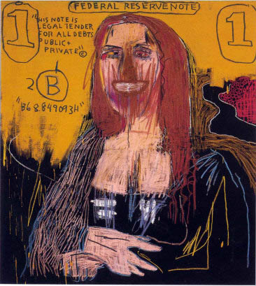
A significant change in the perception of what constitutes as ‘art’ took place as the emergence of graffiti within galleries occurred, where aggressive brush strokes and broad paint splatters ‘emotionally-charged the subject matter’ of pieces by Jean-Michel Basquiat.
Famous Neo-Expressionism artists include the likes of Georg Baselitz and Jean-Michel Basquiat.
An example of Jean-Michel Basquiat Neo-Expressionist art is available to view at:

10. Stuckism (1999 - Present)
Stuckism is a group of painters that refer to themselves as ‘anti-anti-art,’ meaning that they are against movements which are ‘anti-art’ and are in favour of art. Their aim is to get back to the “true spirit of modernism, to produce art with spiritual value regardless of style, subject matter or medium.” They oppose conceptual art and instead opt to promote figurative painiting.
“Although painting is the dominant artistic form of Stuckism, artists using other media such as photography, sculpture, film and collage have also joined, and share the Stuckist opposition to conceptualism and ego-art.” 
Two famous Stuckist artists are Billy Childish and Charles Thompson, both founders of the movement.
To see an example of Charles Thompsons work follow the link below:

References:
1. www.theartstory.org/movement-fauvism.htm 
2. www.theartstory.org/movement-suprematism.htm
3. www.thegaertners.com/aa/index.html
4. en.wikipedia.org/wiki/Lettrism
5. 
www.theartstory.org/movement-fluxus.htm

http://imaginepeace.com/archives/16344
6. www.theartstory.org/movement-arte-povera.htm
7. www.theartstory.org/movement-minimalism.htm
8. www.theartstory.org/movement-op-art.htm
9. www.theartstory.org/movement-neo-expressionism.htm
10. en.wikipedia.org/wiki/Stuckism